Design Portfolio

.png)

Gift of Bread
A Non-profit Organisation(NPO) 'Gift of Bread'.
Group Project: 4 Members
My Role: UX/UI Designer
Duration: 3 Weeks
Tools: Figma, Miro, Trello, Slack
OVERVIEW
Gift of Bread is a Non-profit Organisation based in Sydney, Australia. The group rescues and redistributes surplus fresh bread to stop food wastage and aims to 'share a loaf' with someone in need.
With the theme of community and sharing, our team has decided to redesign their outdated website interface to increase its usability and attractiveness.


01 Research
SOLUTION
Redesign the Gift of Bread website to make it more user-friendly and inviting, in order to increase user engagement.
PROBLEM
The current Gift of Bread website is bland and uninviting. It also has a confusing navigation system which may dissuade users from interacting with the website. Hence, users may unlikely to donate, volunteer or get to know the organisation.
RESEARCH PLAN
To kick off the process, our team initiated User Interviews by formulating clear objectives and crafting targeted questions. This approach allowed us to thoroughly understand the needs, challenges, and pain points of our target users.
.png)
From this approach, we uncovered some critical user needs that needs to be addressed:
-
Lack of NPO's past evidence of work.
-
Absence of information resonating audience
-
No indication of where the contribution goes to.
-
Donation navigation is not difficult and confusing.
By grouping similar thoughts, behaviours, and patterns, I synthesized my findings into Affinity Diagram and Empathy Maps. Based on the highlighted categories, there is now a clear visual representation of the data to well empathise with users.
.png)
USER PERSONA & JOURNEY MAP
Meet our User Persona - Roger, a representation of an ideal user based on our insights gathered from the research phase. From his profile, we put ourselves in his shoes to create his journey of thoughts - a User Journey Map.

Having a User Persona guiding our user-centred decisions, we proceeded to apply empathy on Roger ensuring our product aligns with the target audience.


HEURISTIC EVALUATION
Upon reviewing the existing user interface, we first annotated potential problems by identifying usability issues by heuristics principles.
02 Ideation
FEATURE PRIORITIZATION MATRIX

COMPETITOR ANALYSIS
Understanding the existing Non-profit Charity market in Sydney, Australia is key to evaluate what functionality and other key aspects to your product. Researching our competitors' such as Foodbank, helped us gather their strengths and weaknesses to find a gap in the market that we could tackle. In addition, we also encountered new ideas while exploring their products that came into our consideration.
03. Prototypes
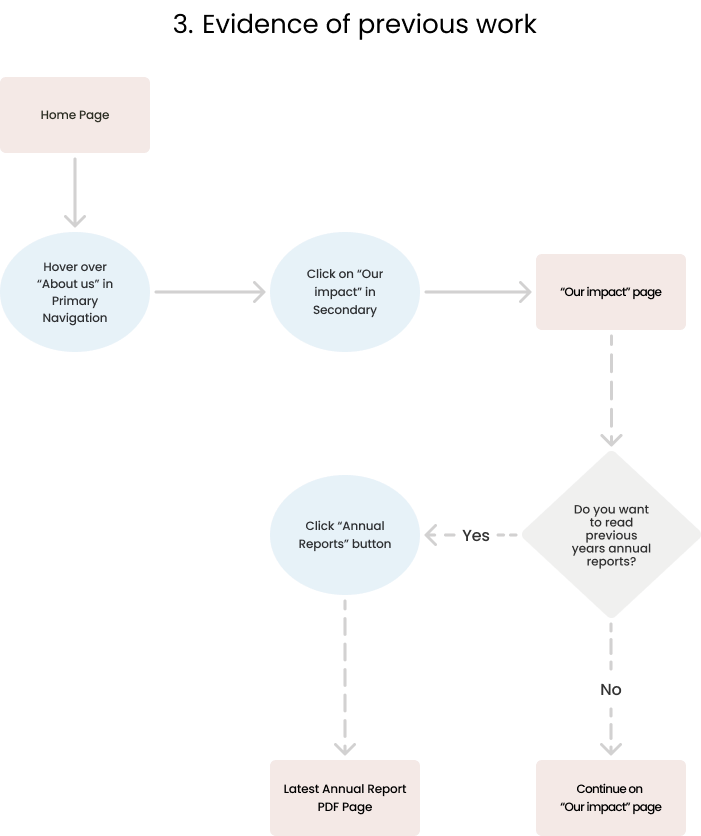
USER FLOWS


LOW-FIDELITY WIREFRAMES
04. User Testing
TESTS
To further improve our designs, a range of user testing was performed on selected target audiences - adults that are married preferably with children (people with the ability to donate to the charities)


05. Design

PROBLEM STATEMENT
People who want to donate to Non-profit Organisations (NPOs) are more likely to donate if they know where their money is going to, and believe that the organisation is financially trustworthy.
HOW MIGHT WE ensure that Gift of Bread communicates where donation money is going to, and instil a sense of trust in their users so that they are more likely to donate?


